Veba Baby
Designing an engaging and intuitive customer navigation experience for users, prioritizing increased customer engagement.
UI Design | Prototyping | Wireframing | Competitor Analysis
TEAM
3 UX Designers
DURATION
4 weeks
CLIENT
Veba Baby
Overview
Veba Baby has just launched an app to accompany their physical product that will ship to their first customers in the coming weeks. The goal of this project is to reimagine the Veba Baby website–currently a single scroll experience–to create a user navigation experience that is streamlined and engaging for future users.
My Role
My team, consisting of two UX designers and myself, had a turnaround time of 4 weeks for this entire project. Given the time and resource constraints, we talked to the stakeholders and came up with a viable project plan and what deliverables would be feasible: industry and competitor research, comprehensive design recommendations, iterate based on client feedback, and prototyping.
Plan of Action
Research and analyze current competitors within baby product industry.
For the competitor research, we conducted heuristic evaluation of three companies with each team member focusing on one. Additionally, the research centered around: how companies are portraying the research behind their product, how product features are being presented, CTAs for the company’s compatible mobile app, the use of social proof (in the form of user testimonials), and patterns in color schemes.
Provide comprehensive design recommendations aligning with industry standards.
After synthesizing the research and conducting a UI audit on Veba Baby’s website, we shared our design recommendations with the client. The redesign’s goal was to create an intuitive, engaging, and educational user experience for Veba Baby’s target audience of new and expecting mothers. The recommendations included revised information architecture, an updated navigation bar and footer, a complete revamp of the FAQ page, an additional page to share the scientific backing behind the product, and more.
Iterate designs based on client feedback & create final mockups and prototypes.
Due to the time and resource constraints, we were only able to iterate our designs based on our client’s feedback (rather than conducting usability testing and gathering user feedback). Fortunately, Veba Baby agreed to conduct their own testing on our final designs. We were able to present high-fidelity mockups in two different color schemes and a full-functioning prototype for the client to test.
Competitive Analysis and Industry Research
Owlet, Emulait, and Nanit are three companies that exist in the baby-product space with an excellent user experience. These companies have very similar target audiences as Veba Baby and by analyzing these websites, I gained a clearer picture of industry standards and what users might be expecting. For this analysis, we focused on: the graphics used, what kind of social proof is available, FAQ pages, designated research pages, product feature displays, and the color schemes.
Hero Images and Graphics
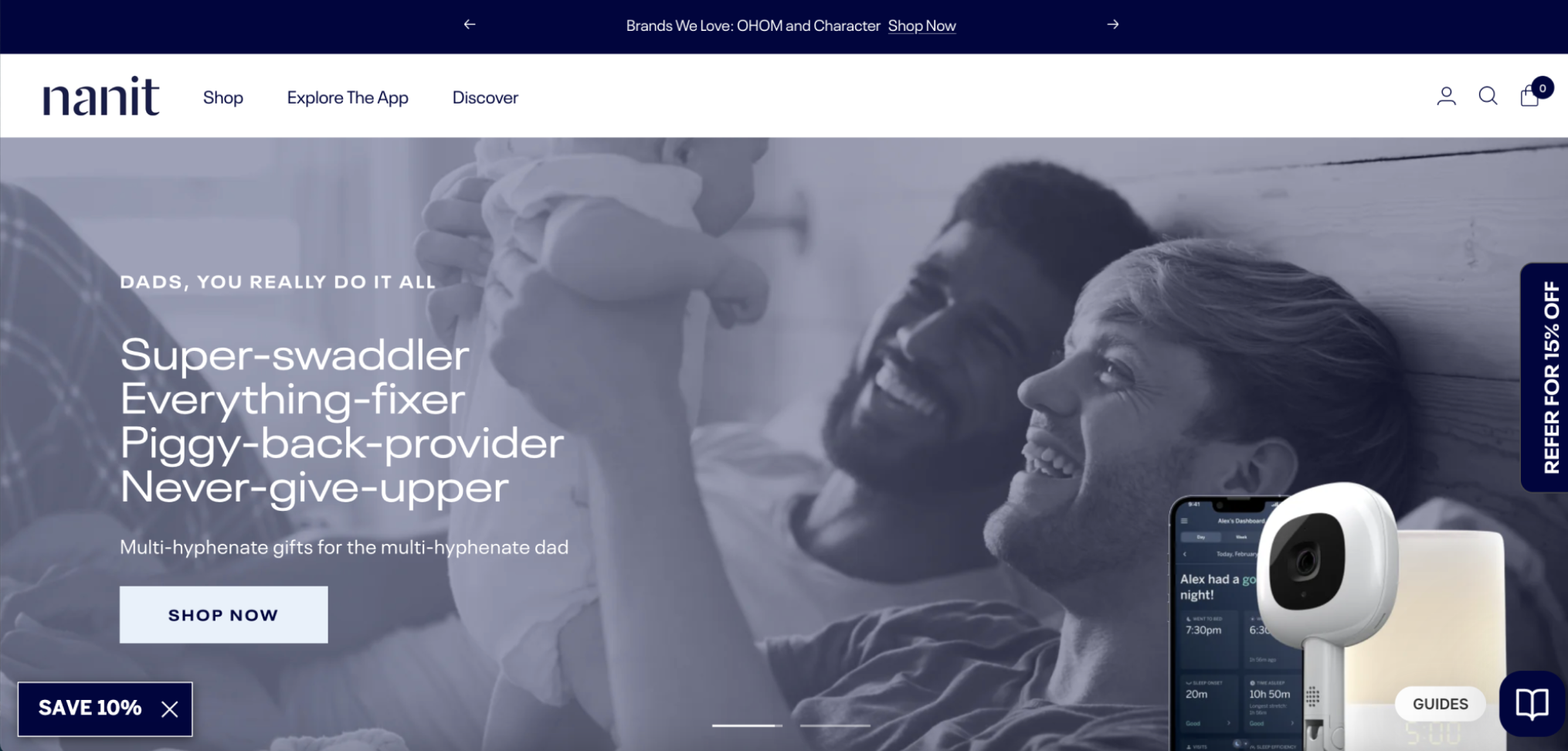
Nanit’s hero image has a rotational approach, where the screens alternate every ~5 seconds to display the different products available. Additionally, the hero image includes pictures of parents with their child, thus invoking an emotional appeal to the user.
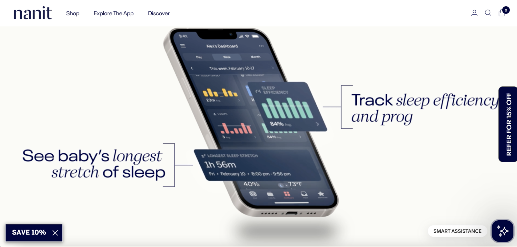
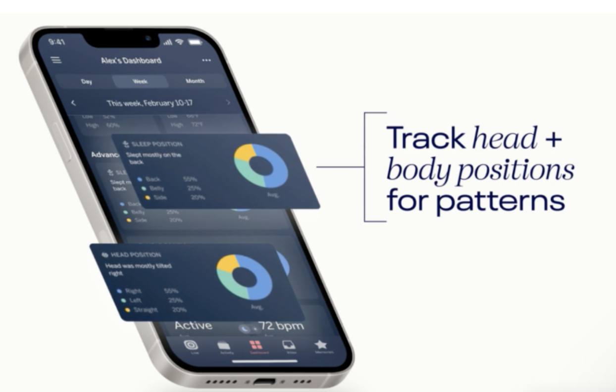
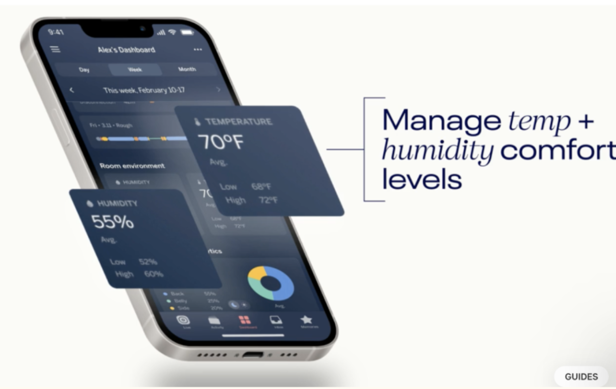
Nanit also displays their product’s mobile app functions in an engaging and concise way. The product value is clearly demonstrated to the user through the use of motion design. In this way, the page is not stagnant and is geared to someone who appreciates and understands technology.
This simplified product feature display can also be seen in Emulait's website. They included a detailed product description with specific call-outs for the bottle’s unique features. The thorough explanation of how the product works can increase the overall customer experience by giving them enough details to make an informed purchasing decision.
Rotating hero images on Nanit.com.
Motion graphics used to display mobile app technology and functions.
Emulait’s product feature display.
Social Proof
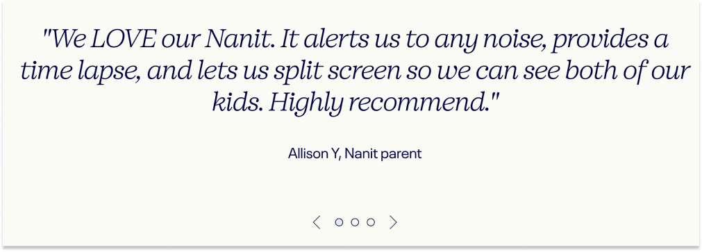
Incorporating social proof in a design drives users towards the tendency of using others’ behavior to guide their own. In other words, including positive user testimonials for Veba Baby’s product would greatly enhance the credibility and trust towards the company and validate the product’s quality.
User testimonial carousel displayed on Nanit.com’s home page.
Designated Research Page
Veba Baby has developed a product that is new on the market: a baby bottle that tracks the expiration of breast milk. In this specific space, there are a few products that address the need to track milk; however, none of these products are a bottle. With this in mind, there was a gap in Veba Baby’s current website experience in the form of the absence of any scientific and research backing for the product. Including research/scientific data to support the product’s quality and effectiveness builds credibility behind the company and can ultimately influence the user’s purchasing decisions. The goal is to present the information in a simple, user-friendly manner.
When expecting or new parents are making the decision to buy baby products, the choice can be very personal and including the research behind a product can give the consumer the full picture and build trust with the company.
FAQ Page
FAQs with expandable buttons created a clean and seamless UI for the user by reducing the text clutter on the page. The streamlined content made for a more convenient user experience and presented the information in a clear manner.
Color Scheme
Among the three brands, there was a consistency in the use of deeper/darker colors as the primary color. The consistency in the color scheme can contribute to brand recognition and sway influence in how users perceive a brand. By using a darker shade of blue (Veba Baby’s primary brand color), the company can convey trust and reliability, along with luxury, to align with the company’s brand identity.
Redesign Recommendations
Our design recommendations had been carefully crafted based on an extensive audit of Veba Baby’s current website, along with a thorough competitor analysis. The goal of this redesign is to simplify the overall user experience, while also being engaging and educational. Additionally with this redesign, we hope to emphasize the value of Veba Baby’s product for all users and especially, the target audience of new and expecting parents.
Product Feature Display
Rather than solely using still images of the mobile app, we recommend implementing a more detailed and engaging approach to displaying the product’s features. The mobile app images are now paired with specific call-outs that label what the benefit of the mobile app are and how those benefits fit into context with the product. Additionally, the image has enlarged notifications to emphasize the convenience of syncing your product with the app.
Recommended mobile app presentation
Navigation Bar
In the redesigned navigation bar, the implementation of the darker blue in Veba Baby’s color palette is used to emphasize a feeling of luxury and trust for users. In addition to changing the UI, our recommendations include:
Using the logo as a link to the Home page can declutter the navigation bar and create a more minimalistic aesthetic, allowing for more space between available pages.
Creating a Research page and including it in the main menu will create easy access for potential customers to review the scientific backing behind the product and can increase product credibility. By being transparent about why a product works, users will feel comfortable and can make informed purchasing decisions.
Reducing the number of pages in the menu bar will emphasize the importance of the pages that are included. The Contact link should be limited to the website’s footer, while the FAQ page and About Us page can be grouped under the new Explore page to simplify the user’s experience.
Original mobile app presentation
Recommended navigation bar
FAQ Page
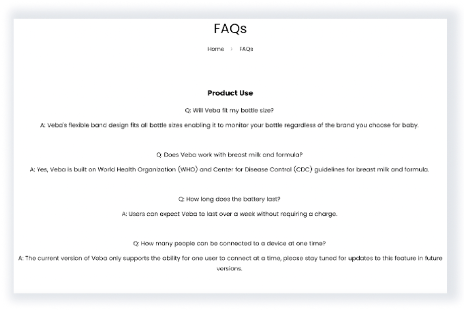
Veba Baby’s FAQ page was a plain-text list of questions without any interactive components. This created a dense chunk of information that would likely be difficult for users to parse through and find their specific questions. The following recommendations aim to simplify this experience:
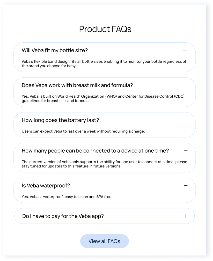
Incorporating expandable buttons within the FAQ page will minimize the amount of text that users immediately see. The reduction of clutter will make it easier for users to find the information that they are looking for.
Using left-aligned text for the questions will provide a visual structure for users and create an effecient experience to parse through available information.
Original FAQ Page
Original navigation bar
Recommended FAQ Page
Company Page
Purchasing new baby products is a very personal and careful decision that is made by parents. Because of this, Veba Baby wanted parents considering their product to know a little more about the founders and the company story. An “About Us” page creates trust between the customer and company, increasing the brand’s credibility.
Research Page
Creating a product for babies requires a lot of thorough research and testing. This research page aims to educate potential customers on how and why Veba Baby’s product works. Giving consumers this information allows them to make informed purchasing decisions, as well as creates trust between the company and customer.
Product Page
It is critical that the product page provides a seamless user experience in order for customers to be persuaded to purchase the product. This page includes a concise product summary, user testimonials, as well as FAQs.


